The Key Element of Conversion Rate Optimization
A great landing page design will make it easy for your target audience to find what they’re looking for on their path to conversion. Landing page designs are an essential part of all marketing campaigns given more than 60 percent of web page visitors will click on display ads if they think it’s relevant to their search. This captive audience is hoping that clicking your ad will provide them with the information they’re looking for faster than digging through organic page listings to find additional information about products and services.
Great landing pages follow some simple best practices and provide just enough information to convert visitors into leads so that you can add them to your email marketing campaign and they feel that they received some value by sharing their email address with you.
If you’re concerned about landing page performance and conversion rates or you’re designing your very first landing page and want to make sure you knock it out of the park, this guide comprehensive guide is for you.

Why Does Landing Page Design Matter?
Before covering the elements and features needed to design the best landing page, it helps to understand why landing page design is important. Many marketers often get hung up on creating great display ads that get people to click through to your company site, but that is only half the battle. Running ads can be very expensive and surely producing a high clickthrough rate is important, but if you cannot convert this traffic on your landing page with a clear call to action your investment is lost.
A poor landing page design can scuttle any momentum from your ad campaign. Visitors may feel overwhelmed or confused by a poorly designed page and may be unsure about what action to take next.
The best landing page design, by contrast, helps the visitor take the next steps by providing an intuitive and clear design that helps the user navigate through the conversion path naturally. It allows your company to capitalize on their curiosity by inviting them to complete a sign-up form, take advantage of a free trial offer, or even schedule an appointment to discuss your products and services in more detail.
Clickthrough rates on ads are low. That makes it all the more important to capitalize on those people who do click your ads and want to learn more about your offering. To further clarify the importance of landing page design, only a fraction of those who actually click through to your new landing page will convert into leads. Yet the people who do arrive on a landing page are already motivated and by optimizing your landing page design you can convert more of these visitors into leads and customers.
Building Trust with Visitors
Good landing page design is important even if a visitor still ultimately clicks away. A landing page may be the first impression a customer has of your brand, business and product. This is especially true if they click through from a search results page.
If the page they land on is disorganized or unattractive, they may form a poor opinion of your business and be less likely to click any future links or ads and may discount your website as a valuable source of information.
If your landing page is well-designed, you’ll make a much better impression on visitors. They may not be ready to buy or sign up right away, but they’ll still be willing to consider your brand in future buying decisions. The next time your name comes up, they’ll be much more likely to click or even to seek out information from you given the familiarity with your brand and the positive experience they had on your landing page.
The Key Elements of Landing Pages
There is no single way to design a landing page. Despite that, most landing pages that perform drive a high conversion rate have similar features and follow specific layout guidelines and best practices.
No matter how you choose to design your landing page you’ll want to make sure that the layout works best for your page content and offering and includes some key elements.
Headers and Hero Banners
The header or hero banner is what appears “above the fold” on a landing page. That means it’s visible to the user without scrolling. It’s the first thing a visitor sees as a result and is the most valuable real estate on the page. This is the “make or break” moment for your page.
The header must do a lot of the heavy lifting as a result. A good header should include the following elements:
- A compelling image, often in the shape of a full screen, or edge-to-edge banner
- A headline that makes a pitch and incites curiosity or motivates conversion
- Your branding
- A clear and distinctive call-to-action
You may also want to include a sub-headline. The headline itself makes a pitch, but it isn’t always clear what the product or its benefits are from this copy alone. The sub-headline can provide more context and support.
The branding helps the visitor identify your business and assures them they’re in the right place. A call-to-action tells them what to do next. Most often, the CTA is an invitation to download an app, schedule an appointment, or get in touch with your team for visitors that need more information.
It can also advise your audience to take other steps on the page. You might invite them to subscribe to an email newsletter or sign-up for updates on your next product launch.
Content
The header contains the pitch and a call-to-action, but your audience may need more information before they’ll take action. The main content of your landing page should fill in the details and elaborate on why they need your product or service. The content should make a compelling argument and present the user with a value proposition. In short, use your content to convince the visitor to take the next step.
Images are a key type of content for your landing page as well. People process visual information much faster than they process text. Beautiful images can support the points you’re making in your copy or showcase products and convey more emotion.
The same is true of bulleted lists and headings. These elements help make your content easier to read and understand at a glance.
Calls-to-action may also be part of your body content whether they are text-based or a traditional CTA button. Depending on the purpose of your landing page and its length, you may have multiple CTAs throughout the page.
The nature of your content depends on what the purpose of the landing page is. If you’re trying to sell a product, you’ll likely want to include product specifications. If you’re trying to convince people to sign up for a service, you may want to include customer reviews or other social proof.
The Layout
The design itself plays an important, yet subtle, role in your landing page’s effectiveness. A beautiful design that uses white space and colour contrast well is more inviting.
The form should always support function here as well. Good design can make it easier for visitors to find the CTA button. By contrast, a cluttered design may allow certain elements to get lost in the experience, resulting in confused visitors and a high bounce rate.
Footers
Finally, most landing pages contain a footer section. This part of the page usually includes legal disclaimers and copyright notices. In some cases, it may also include links to other pages, social media, and contact information. However, over years worth of experience designing effective landing pages, we’ve learned that placing a well-crafted call to action in the footer as a final thought can deliver marked improvement to the conversion rate.
Great Landing Page Design Examples
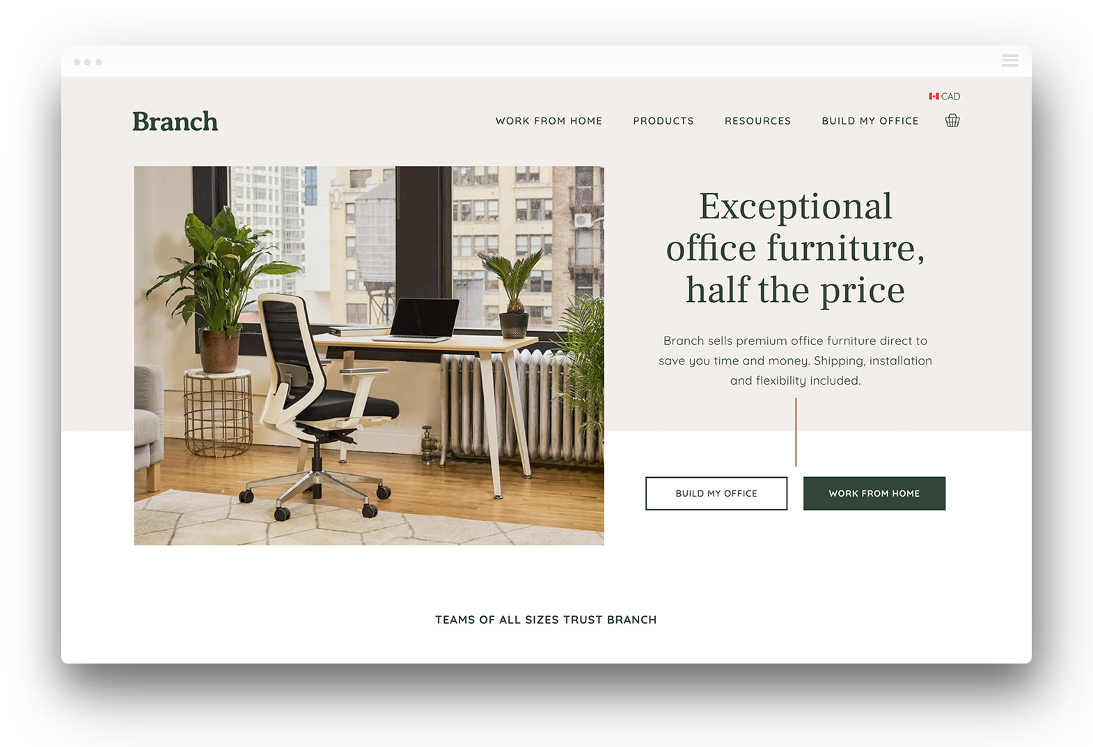
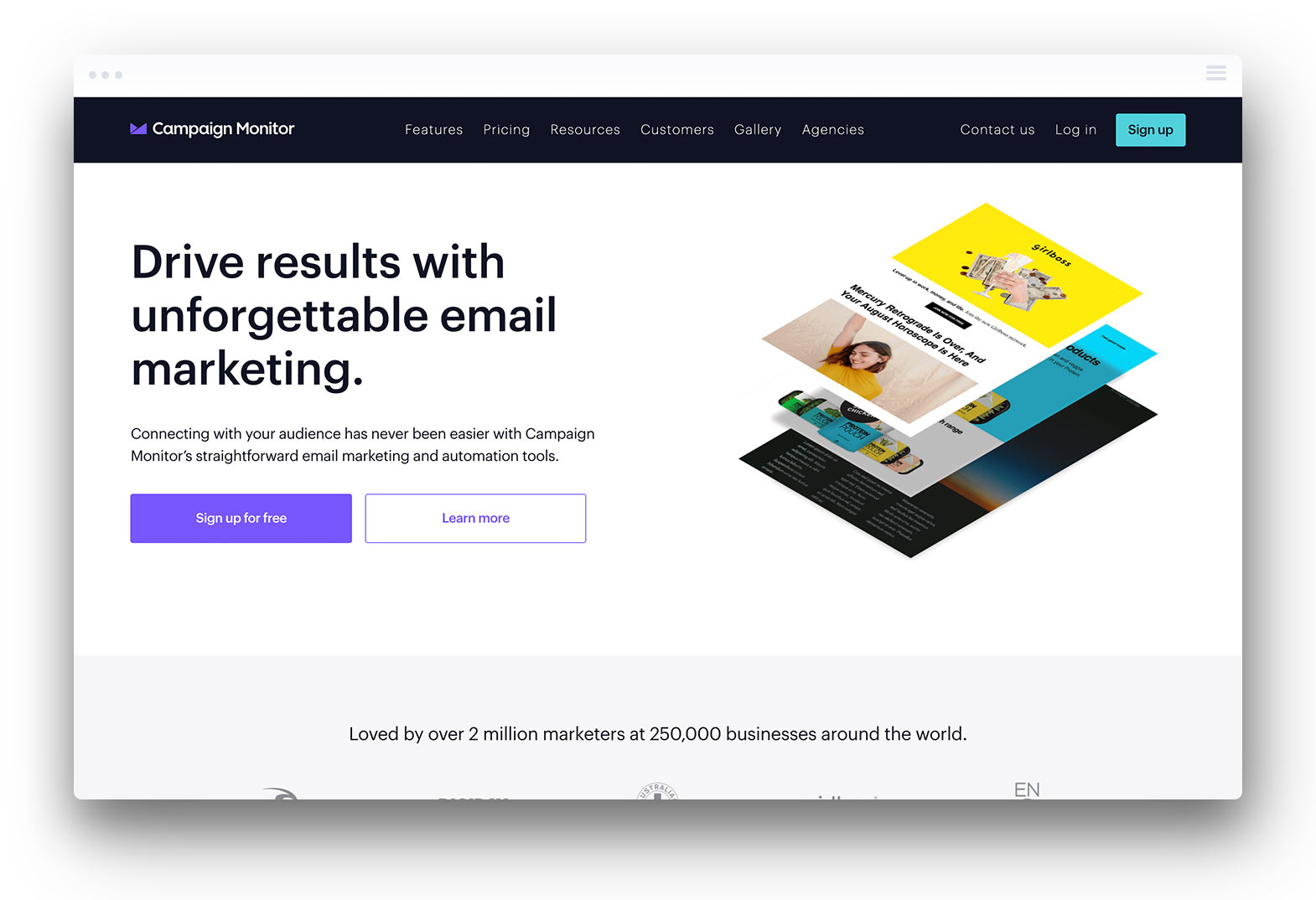
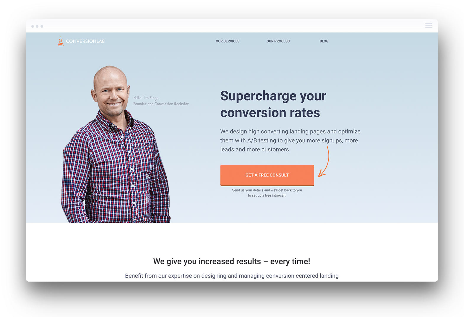
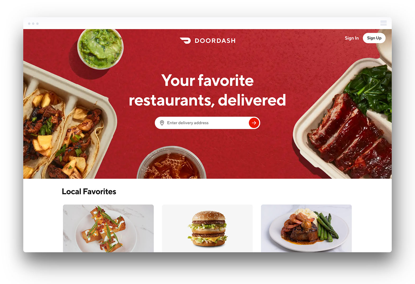
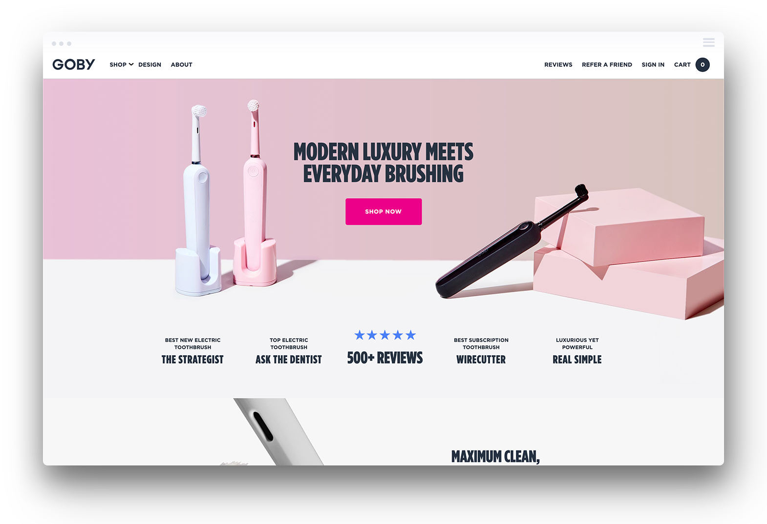
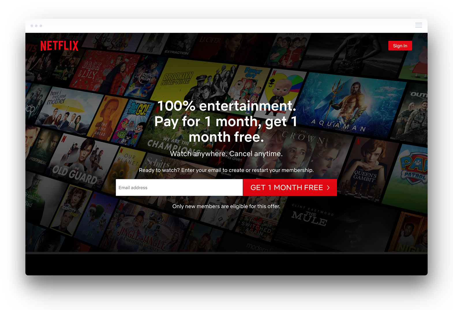
When you follow best practices and use the most important elements that make up successful landing pages the creative website design process can lead you just about anywhere. Looking at the following landing page design examples you can see how unique each design is, while the fundamentals remain consistent within each example.
Landing Page Optimization Tips
With a thorough understanding of how your landing page works and what should be included within the design the next step is understanding how to optimize your landing page.
Set a Clear Goal for the Page
The very first step in crafting an effective landing page is to set a goal. Ask yourself, what should this page do?
The goal of a landing page is usually to drive conversions of some sort. From that standpoint, your landing page’s goal is typically tied to the primary CTA.
What action do you want people to take when they land on this page? If you want to increase downloads of your app, then the landing page’s goal is to encourage people to hit the “download now” button.
Having a clear objective for your landing page will make it easier to select the right images and write convincing copy. If you’re not sure what you want people to do when they arrive on this page, you’ll have a harder time convincing them to convert.
Write Compelling Copy
Landing pages that convert well convince the user to take the next step, but what makes compelling copy? In short, tt depends on what you want to achieve with the landing page. If you want someone to sign up for a free trial to your service or application you’ll want to include the benefits they will experience in doing so. What does your offering do that your competitors do not?
Keep in mind that most people don’t move beyond scanning or skimming copy. They’re not necessarily reading word for word. Your copy should be clear and concise as a result, with lots of visual breaks.
A reader should be able to get a good idea of what the primary benefits of your app are by skimming through the headings. Lists highlight important facts that readers can glean at a glance.
Good copy also focuses on emotionally charged language. If you sell pet insurance focus on the reader’s desire to protect their pet. If you offer an app that increases productivity, emphasize how your product can help busy teams.
Have One Clear CTA
A common mistake for marketers is to have more than one call-to-action on a landing page. This does not mean limiting your page to a single button or lead generation form, but focusing all your CTAs on one action. It’s important for the CTA to stand out and be the obvious next step as if there is any confusion in what the next step is, the user will not convert.
When you set a clear goal for the landing page establishing a single call-to-action is much easier.
Use Images to Support the Message
Choosing images or illustrations that support the primary message on your landing pages is very important. If your offering makes it easier for teams to collaborate remotely choose imagery that showcases just that. With software and web apps specifically, showing screenshots of the application interface and how easy to use it is go a long way in driving conversion.
If you’re selling a specific product, then you’ll want to include images of the product itself. If you’re selling a service and pride yourself on excellent customer service, then consider adding pictures of your team.
Keep in mind that people respond best to pictures of people. They also respond better to custom images of what they see as “real people” versus stock images.
Make It Interactive
Today’s customers want to be involved, so you may consider creating a more interactive landing page. You might invite someone to click a button or submit a form, but could you do more to engage them?
Swipe transitions can help users feel more involved, while scroll-triggered animations could introduce more wow-factor. This can be exceptionally useful for product demonstrations. It’s also much more likely to engage and delight a visitor.
Testing and Tweaking
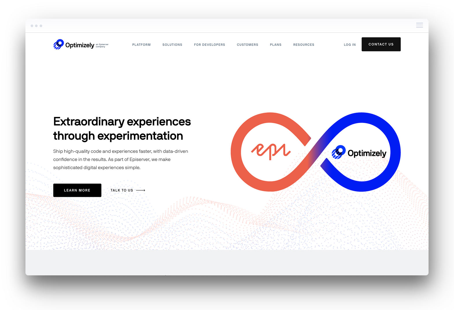
Best practices for landing page design always include testing. You may think you have a winning design, but it may not perform the way you think it should. A/B testing is used to compare variants of a landing page. You may have only minor differences, such as slight tweaks to the copy. You might compare different layouts or different images to see which performs best.
Testing allows you to tweak the design to improve performance. There are plenty of landing page tools out there to assist with testing like Google Optimizer or Optimizely.
Tips for Good Landing Page Design
Once you’ve decided on the content for your landing page, it’s time to lay it out. Remember that design plays a role in both convincing your visitors and helping them navigate your offer.
Less Is More
Minimalism has been considered trendy in web design for the last few years, but there’s good reason behind it, much like the age-old saying, “less is more.”
Simplicity is often the most effective approach to website design. A minimalist design layout makes it easy to find important information. It also helps highlight key features, such as CTA buttons. It’s also easy to navigate, and it’s especially easy for the visitor to take that crucial next step.
By contrast, a page with too many visual elements and loads of copy risks overwhelming visitors. They may not know where to look or what to click and if they can’t find the “contact us” button, they’re going to leave.
Minimalism is important as more potential customers experience your landing page on mobile devices. As device screens vary in size, a page that looks good on a large laptop screen may look cluttered and claustrophobic on a much smaller smartphone. Minimalist design can help avoid this issue and keep your page looking beautiful on every screen.
Use White Space Effectively
White space or negative space is the area that isn’t occupied by elements like text or images. White space is like the “breathing room” around the other elements on your page. Less white space can make a page feel cluttered. Too much white space, by contrast, can make elements feel disconnected.
When used effectively, negative space can emphasize or amplify the important elements on your landing page. A CTA button with lots of space around it is much more visible than one that’s flush against a bold image. The white space actually directs the user’s eye towards that button.
Use a Heat Map to Optimize Layout
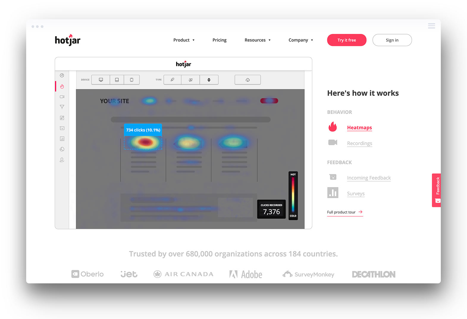
While white space can be used to direct the user’s attention towards what you want them to pay attention to, a heat map can provide insight into how visitors are engaging with your page and help you organize elements in a way that keeps people moving through the preferred conversion path.
Most people don’t read landing pages word for word. Instead, they skim or scan. There are two common patterns to keep in mind:
- Z pattern: the user starts at the top left and scans to the right, then moves down and repeats
- F pattern: the user starts at the top left, scans to the right, and then moves down a line and repeats
The F pattern is more common on text-heavy pages. The Z pattern is more often seen with image-laden pages, as people move from element to element.
During the testing phase, you can see how people are engaging with the page via heat map.
The map may tell you that they’re sweeping the page in the Z pattern. From there, you may want to adjust your layout, to place information and CTAs in the hot zones.
Heat maps can also tell you what content people spend the most time on. For example, people often look at pictures of people longer than they look at images of objects. A/B testing different images could tell you which ones are commanding the most attention.
Choose Fonts and Typefaces Carefully
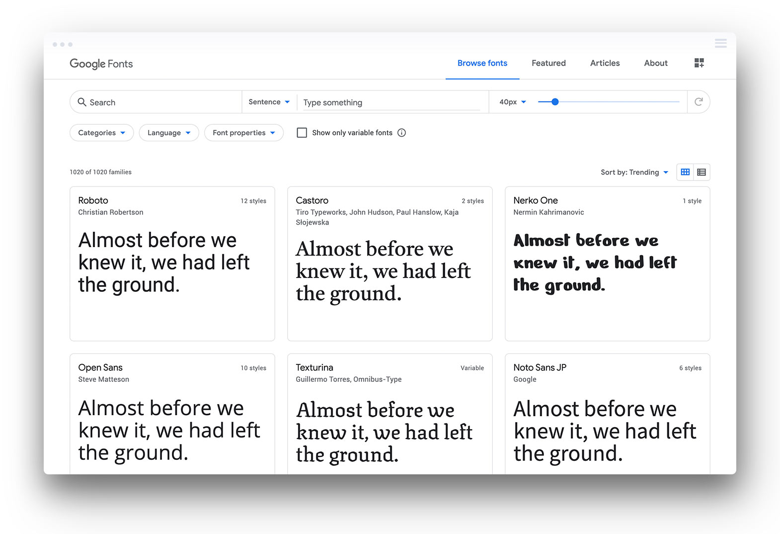
Another key component of landing page design that people often overlook is typography. Typefaces can help make your page easier to read or harder to read.
Many landing page optimization tools will help you test the readability of your site, which includes feedback on typefaces. They’re an important part of web accessibility.
Sans serif fonts are typically preferred for digital experiences as they offer a cleaner look. Serif fonts have traditionally been used to assist with reading as the serifs help letters flow together.
Typefaces also have an emotional impact on visitors. A bold sans serif typeface could feel futuristic or confident. A serif font may say “tradition” or even “luxury.”
If you have brand typefaces that you use, be sure to incorporate them here. The right typeface can help deliver the right message in more ways than one.
Select the Right Colour Scheme
Just as typefaces convey emotional messages to visitors, so do colours. Blue is often associated with trust, tradition, and confidence. Green may be associated with money, health, and the environment.
Often, landing pages will reflect your website design as well, so incorporating your brand’s colour scheme connects your landing page to the rest of your company.
Colour plays another important role in design. Bold colours can attract attention and help highlight important features of the page. Contrasting colours can also create more emphasis.
Improve Your Landing Page Performance Now
There are many factors that go into good landing page design and optimization. If you want to get the most out of your ad campaigns and marketing spend creating an optimized landing page is critical.
If you’re not the creative type or feel overwhelmed by landing page design, don’t be afraid to ask for help. Landing page design services from a reputable web design company can help you get more out of every campaign. Ask us how you can get started right now.


