Updated for 2020.
I’ve spent almost twenty years building my Toronto web design company. Over this time I have had the opportunity to work with many great website designers and pick up many new UI and UX design ideas and best practices along the way. I’ve also had many opportunities to share what I’ve learned about creating a great user experience design with new designers and others than join our team. Many of the following tips likely seem quite obvious to achieve good design, but I find it never hurts to have a refresher or add a little reinforcement for new designers honing their craft. My hope is that any web designer can use these tips to help make a better and more accessible internet.
1. Subtle Call-to-Action Design for Negative Links
In many website UI designs, we often see negative or secondary links designed as a bold button. In some cases, we see a button that is even more vibrant than the positive call-to-action. In these instances, a subtle text-based link for the negative or secondary call-to-action is much more effective and puts the emphasis on affirmative action – where it should be in most cases – by removing any potential distraction or confusion associated with two competing buttons.
To add further clarity and improve user experience, leading with the negative action on the left and finishing with the positive action on the right can enhance ease-of-use and ultimately boost conversion rates within the website design. In our North American society we read top to bottom, left to right. If a web designer placed the desired positive call-to-action on the right, the user can scan the links naturally from left to right and then click without having to back-scan to find the positive call-to-action.

2. Aligning Text
All web users look for information the same way when landing on a website or landing page initially. Users quickly scan the page and make sure to read headings looking for the particular piece of information they’re seeking. Web designers can make this experience much smoother by aligning groupings of text in a precise grid. Relying on good grid-based text alignment will save the user time and is an efficient way to clean up text layouts and ensure your website design and content are easily scannable.
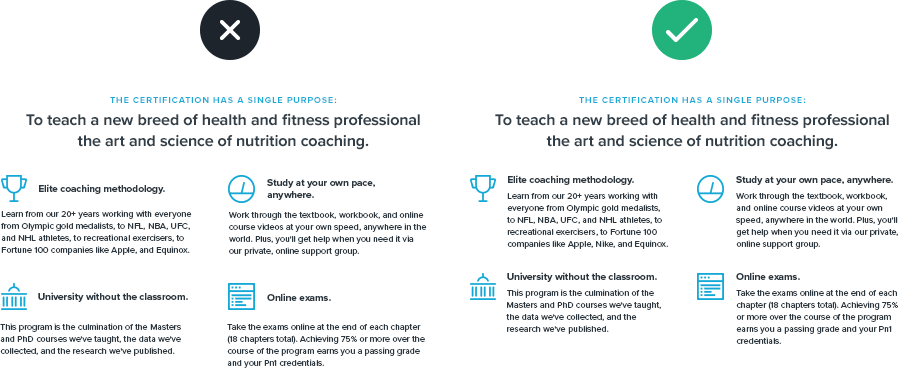
3. Control Your Borders
Using too many borders in your user interface design can complicate the user experience and leave your website design feeling too busy or cluttered. If we make sure to use design navigational elements, such as menus, as clear and straightforward as possible we help to provide and maintain clarity for our human audience and avoid creating visual clutter.
Good UI design and UX design tips:
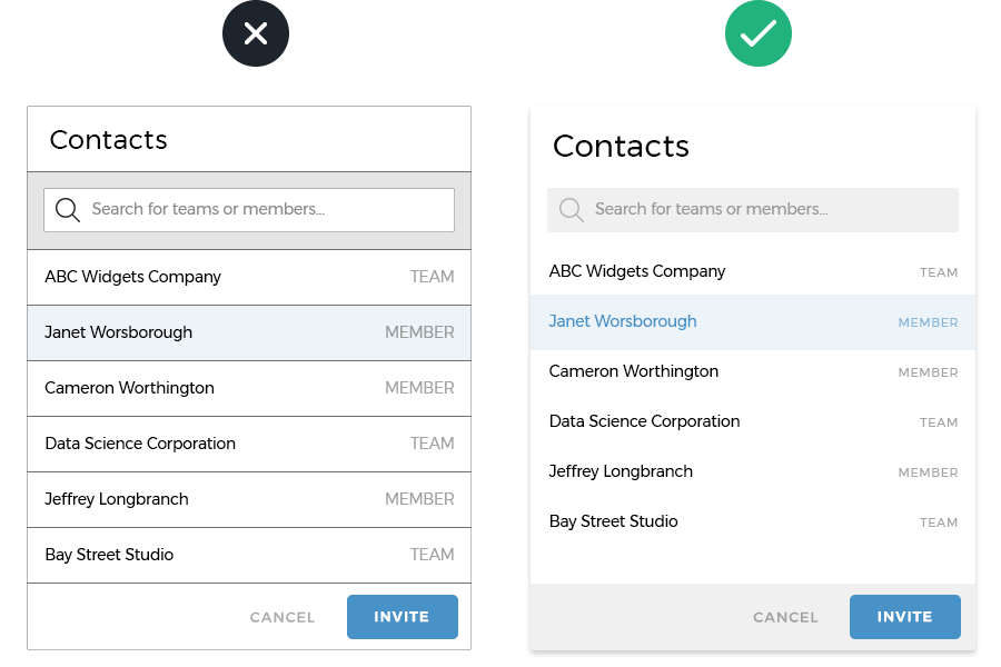
- Give search fields a subtle background colour instead of a border
- Replace borders between navigational elements in menus with extra padding
- Use a subtle background colour to separate buttons or calls-to-action instead of a border
- Give menus or modal windows a soft drop shadow instead of a border.
4. Icon Contrast
This is a personal pet peeve of mine and it’s quite prevalent in UI design across the web and mobile apps. It’s quite common – and lots of fun – to design custom icons within your website design to add some personality and infuse more of your corporate branding throughout the experience. Sometimes web designers end up creating an icon design style that has heavier line-weights than the text labels they’re created to support. If you find yourself in this scenario you can help balance the icon and text to make the UI easier to read and scan by users. I most often suggest slightly reducing the opacity or making the icons lighter than the corresponding text. This design fundamental ensures the icons do what they’re intended to – support the text label – and not overpower or steal attention from what we want people to focus on.
![]()
5. Use Increased Letter Spacing with All Caps
As a web designer, sometimes using all caps to set type is simply irresistible. If done subtly and tastefully it can add a real professional sense of typography to your UI design. A great way to make use of this typographic trend is to set your pre-header in smaller, all caps with exaggerated letter-spacing above your main page heading. This effect can bring a hero banner design to life and help communicate the intended message more effectively.
6. Two Column Web Form Design
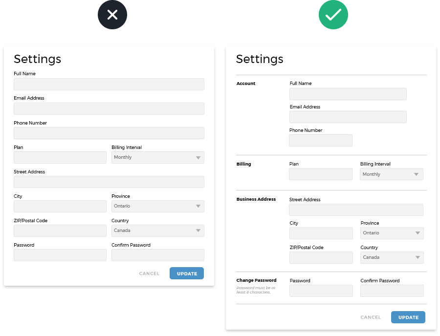
No one likes to use web forms at all and today’s marketing focuses on landing pages full of them. With online privacy front and centre in everyone’s mind these days, web form design is under more scrutiny than ever. As a web designer, we spend considerable time and effort to make a beautiful website design that attracts a good volume of users and ideally convinces them to convert. Our rule of thumb to make sure that your web forms are friendly and concise is the all-important final step in that conversion process and can justify all of your UX decisions prior.
Using a two-column approach to your web form not only allows them to be more responsive to desktop and mobile devices, but it also helps break up extensive forms into a more organized, friendly user journey that offers a more inviting experience to users in that final stage of conversion.
7. Use Subtle Keylines to Connect Web Content
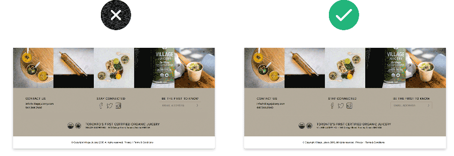
Nearly every day I stumble through a handful of good website designs that seem to just give up at the very end. They’ve shown me a beautiful hero banner, a tasteful layout for page content, maybe even a few well-executed calls-to-action throughout, only to leave the rest of the page and footer looking like the universe after the big bang.
Every element a web designer is responsible for creating within the UI UX design is important! If we take a couple of subtle keylines and make sure to use them carefully to help group separate visual elements and page content a designer can tighten up the UI and offer a much more professional and well thought out experience to users.
8. Input Field Styling
It’s the little details that define the components in great website UI. How often do you end up on a website, ready to buy whatever it is you’re after only to be presented with a white page filled with black rectangular boxes demanding your personal information. Gross! When my clients push me down this road I often get them to imagine a scenario where they want into a store to buy a product and just as they enter the door, a salesperson walks right up to them and starts asking personal questions. Most of the time they quickly realize we’re fighting against that same experience online and come around to following my advice to make use of better UX design practices.
When a web designer puts in a little extra effort to lightly style input fields the results pay off tenfold.

Share Your UX Design Tips
What are your top UI or UX design tips that have lead to success for your clients?
How do you work UX design into your website design process?
What tools do you use to aid in UX design and involve your clients?
About Parachute Design
Since 2003 Parachute Design has been a Toronto web development company of note. Our experience has helped our clients identify their digital marketing needs and make better use of their marketing budgets to drive conversion and online sales. For more information about how we can help your business grow or to learn more about our work, please give us a call at 416-901-8633.
If you have and RFP or project brief ready for review and would like a a free quote for your project, please take a moment to complete our proposal planner.


