Understanding the “Clickable Elements Too Close Together” Error in Your Google Search Console Account
Most of your website’s traffic is probably coming from one mobile device or another by now and if your website isn’t fully optimized for mobile users, you are very likely missing out on top search engine rankings as well as high-value web traffic.
If you’ve received the “Clickable elements too close together” error message from your Google Search Console account, you are going to need to invest some time uncovering affected URLs and optimizing your website for your mobile audience. Improving usability issues is an essential part of the website SEO process to make your website mobile-friendly and perform well in the Google index.
If you don’t have a Search Console account already, you can quickly set one up here. GSC is not to be confused with Google Analytics, which is designed to monitor and track user actions on your website, while Search Console monitors and tracks your website and its performance in Google search as well as how well your website adheres to guidelines and best practices outlined by Google itself. Both of these free tools are staple resources for managing the search engine optimization of sites at any level.
Website owners will often see alerts for the “Content wider than screen” error during mobile optimization testing. This mobile usability error can also be corrected easily to improve your user experience and SEO scoring.
The first and most important step in resolving this mobile-friendly issue is understanding what this alert means in order to correct it. Then, with a little detective work to uncover the URL displaying the issue it can be resolved and confirmed through a mobile-friendly test before being submitted via the validate fix option in your GSC account.

What Does the “Clickable Elements too Close Together” Error Mean?
When you test your sites using the Google Search Console mobile usability report, you can study how efficient and effective the user interface design is for mobile users to navigate your site. This mobile-friendly test takes various considerations into account, including all of the clickable text and graphics on your page in relation to neighboring elements to determine if people will have trouble clicking on their intended target or if you should add spacing around items with links.
Clickable elements include things like links, buttons, and clickable images. It is important that you allow enough space between clickable elements for mobile users to cleanly tap with their finger without accidentally tapping a neighbouring element and initiating an action they don’t want or expect. This fundamental user experience design principle applies to all facets of interaction design ranging from web to mobile apps and even standalone terminals like ATM machines.
The Touch Target Principle
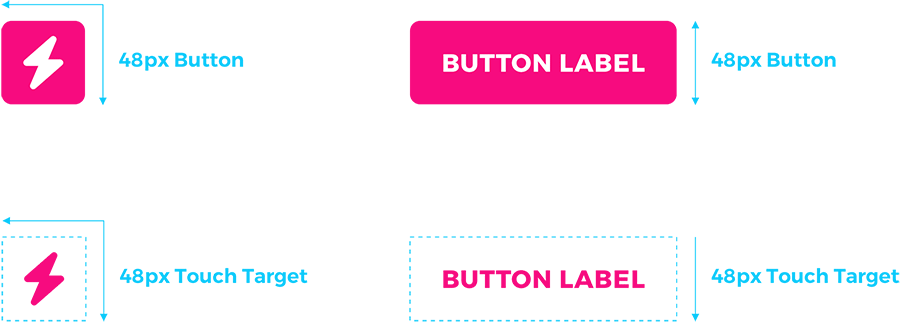
It should be just as easy to navigate through your site on mobile without relying on a mouse or keyboard as it is with these common desktop tools. Understanding the “touch target” principle is important to determine how comfortable your website is for visitors to use on a mobile device. The minimum touch target size for a mobile device is 48px square. Following this UI design principle means that all clickable elements, text links not included as font size is relative, are a minimum size of 48px by 48px and users are less likely to accidentally click on the wrong thing and land on a link they don’t want.

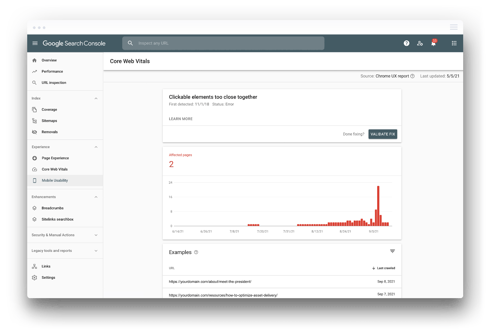
When Google reports a “Clickable elements too close together” error in the mobile usability section of your Google Search Console account, it means the mobile user experience is uncomfortable somewhere within your website. Within your GSC account, you will find an example URL or link that has been flagged with this error that you can use to run a mobile-friendly test.
Users might have difficulties navigating your site and tapping on buttons or clickable elements because clickable elements are either too small, making them difficult to tap, or more commonly, the tap target size is too close to neighboring elements to cleanly press the intended button.
Clickable elements being too close together can affect your website’s user experience (UX) significantly. User experience is a major ranking factor on Google, so if your mobile UX is not up to snuff, you’ll find that it is much more difficult to climb the rankings and appear in the top search results and compete with sites that offer a better mobile experience.
This error is also considered to be an accessibility issue as it could make your site more challenging for any users that struggle with vision or dexterity issues.
If you don’t resolve mobile usability issues where elements are too close together, your site will start to lose popularity and it will steadily drop in search engine results until the error is fixed.
Why Does it Appear?
There are a number of different reasons why the “Clickable elements too close together” might appear. Google is constantly monitoring the activity on your website aside from changes to your content and meta description. If your site shows signs of a bad mobile user experience, then this raises a red flag for Google. As a result, you could get a “Clickable elements too close together” alert and it could affect your SEO performance.
Poor Website Design
This common error is most often related to the interface design of websites. If you’re trying to fit too many elements together on a page, then that page could become congested on smaller mobile screens compared to the desktop URL. Having too many interactive elements too close together creates a usability issue for mobile visitors. The page feels squished together, and the different elements are difficult to see and tap. This could prompt the clickable elements too close together error.
Issues with Mobile Responsiveness
Another possible cause comes down to the mobile responsiveness of your website. Websites need to be optimized for the user’s device. The site should automatically respond to a variety of different devices so that the web page fits the screen comfortably.
If your site has issues with mobile responsiveness, then it might display slightly askew or distort parts of your web page when viewed on certain mobile devices. The clickable elements might not fit into the smaller screen properly and they could be squished together or even warped to fit in a specific piece of screen real estate. Fortunately this is often fixed quite easily with a minor CSS adjustment.
The bottom line is that the Google Search Console error occurs if the clickable elements of your web page do not offer an optimal experience for mobile browsing.
Google is Unable to Request Resources
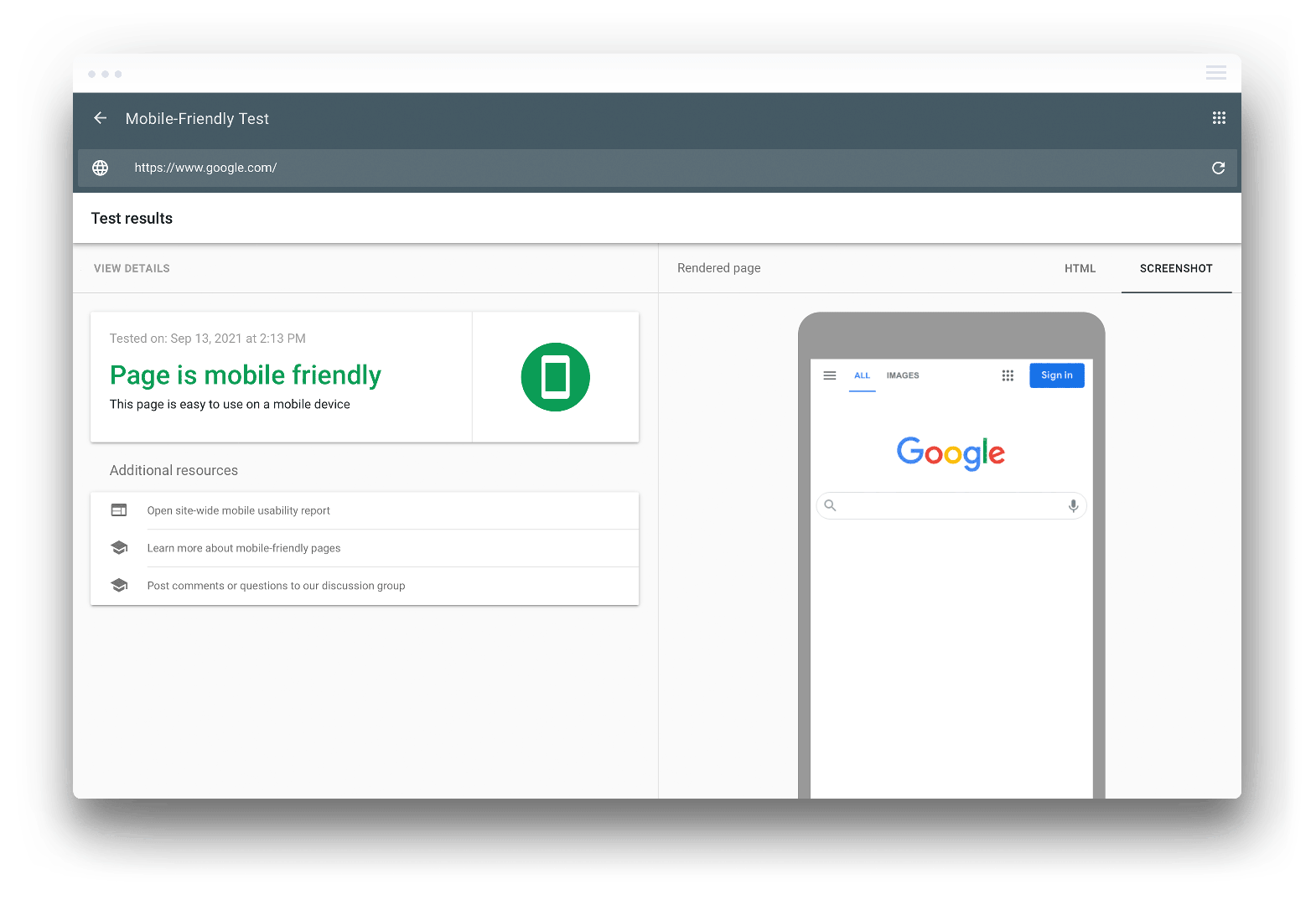
One other potential reason that you may receive the clickable elements too close together error is that Google might not have been able to request the resources needed during the page rendering process. It’s important to run your site through a mobile-friendly test before you launch and continue to test regularly after launch if you are making updates to your site. If your page passes this test, then there’s no need to worry about the “Clickable elements too close together” error cropping up.
If the page does not pass the test, then you will need to address this error on the affected pages as soon as possible.
It’s important to identify the exact URL and to run a Google Mobile-Friendly test as well as checking it in Google Search Console. This will help you to identify the mobile usability error and any pages that require fixes.

How to Fix the “Clickable elements too close together” Error
If you identify a “Clickable elements too close together” error on your site, you will need to fix it as soon as possible to avoid issues with your position in search engines and optimize the mobile experience. This alert indicates a significant mobile usability issue that can cause a lot damage to your SEO rankings and overall user experience if left unchecked. Luckily, the issue is not too tricky to fix on most websites.
Here are a couple easy ways to identify the affected URL and resources that you can use to fix the error.
Optimize the Touch Target Size
Probably the most common reason that this error occurs is that some touch targets are too small within your website design.
A smart approach when creating web pages is to ensure that all tappable targets are defined using device-independent pixels (dpi). This helps to create a flexible layout, where the targets scale to the right size based on the size of the screen. So, if you optimize the size of the touch targets, they will end up fitting the users’ screen perfectly.
Remember, the minimum recommended touch target size on mobile devices is 48×48 px. This is the right size for most fingers to comfortably tap on to avoid the Google error.
To find the URL or page links that are affected log in to your Search Console account and go to the Mobile Usability section. Here you will find a report with each URL that is affected and you can analyze these pages in a new window to uncover the issue.
Then, when you locate the touch target elements that are causing the issue, resize the touch target to at least 48px. This should immediately correct the error. You can do this by inspecting the specific touch target element and increasing the CSS padding to 48px. You could either go through all of your clickable elements, and bring each one up to 48px, or you could identify the exact element that’s causing the issue with a little detective work.
You can identify the element with the Mobile/RWD Tester plugin in Google Chrome. The plugin allows you to view the page as it would be seen through a mobile browser. Use this to locate the elements that are too close to each other quickly and make short work of the fix.
Check the Mobile Viewport Tag
A mobile viewport tag is what tells the browser to match the size of the user’s device to the viewport. If you don’t have this tag on your site, then the clickable elements too close together error will occur.
You can fix this by adding a section of code to the head of your HTML code. Try the following code:
<meta name=”viewport” content=”width=device-width, initial-scale=1″>
With this code inserted, your website will become much more mobile-friendly.
Check the Input Method
The input method is the method or device that is being used to interact with a website. This could be through a touchscreen (known as a coarse input method), or a mouse and trackpad (known as a fine input method).
If the input method is coarse, then the user is most probably using a mobile browser. Now you can use CSS code to change the size of the tappable target. This can be done on your WordPress site or through a plugin.
Validate the Fix
Once you have made the fix, make sure to go back to GSC and click “Validate Fix” for the URL that was addressed. This will check the page again, and resolve the error that was previously flagged in your Google Search Console account.
Conclusion
“Clickable elements too close together” is a fairly common mobile usability error that can be addressed and resolved fairly easily. If your site is not properly optimized for mobile, then it can have a damaging effect on your SEO performance and on the experience provided to your website visitors.
Follow the steps above, and make sure that your site is truly responsive to avoid such an issue. Google loves a mobile-friendly site and it is essential for keeping visitors happy when interacting with your website as well.


