The Quick and Easy Fix for “Content Wider Than Screen” Error
Have you ever experienced the frustration of browsing a website on your mobile device only to encounter content that just won’t fit on the screen? This is one of the most common mobile usability errors reported in Google Search Console (formerly Google Webmaster Tools). This issue is known as the “Content Wider Than Screen” error and can significantly impact user experience and search engine rankings. Fortunately, in most cases, there is a quick and easy fix to this troublesome Google Alert.
First, let’s dive into the causes of the “Content Wider Than Screen” error, the importance of mobile usability, and, most importantly, a step-by-step guide to resolving this issue. In no time at all, you’ll be well-equipped to tackle this error head-on and optimize your website for a seamless mobile experience.
Key Takeaways From This Article
- Understand the causes and importance of the “Content Wider Than Screen” error as one of the most common mobile usability issues.
- Utilize responsive web design, adjust image scaling, fine-tune CSS media queries and utilize Flexbox CSS layout model to resolve errors.
- Validate and monitor fixes with Google’s Mobile-Friendly Test and Search Console to maintain website optimization.

The “Content Wider Than Screen” error occurs when elements on a webpage are larger than the screen size, forcing users to scroll horizontally or leaving content invisible. This mobile usability error can be attributed to various factors, such as employing non-responsive web design, utilizing images disproportionate to the screen size, or configuring CSS media queries incorrectly. Failing to address this error can harm user experience, decrease traffic, and lower search engine rankings due to poor performance in key SEO metrics.
The initial step in tackling this issue involves comprehending the root causes of the “Content Wider Than Screen” error and the importance of mobile usability. We’ll explore the common causes and the significance of website optimization for mobile devices.
Causes of the Error
The “Content Wider Than Screen” error, as it’s known, could stem from several possible factors. One such cause is web pages not scaling appropriately to fit various mobile screens, pages not optimized for mobile devices or different screen sizes. In some instances, blocked resources due to the site’s robots.txt file and cached CSS files can also cause this error, forcing users to scroll horizontally and negatively impacting the user experience.
Images that exceed the width of the screen size may also be the culprit behind this error. To fix this issue, ensure that images scale to the screen size automatically by setting a maximum width of 100%.
Another cause of the “Content Wider Than Screen” error is improper CSS media queries, which do not scale the affected page to the appropriate size for various mobile screens.
Importance of Mobile Usability
Mobile usability holds paramount significance in the digital world of today. With the ever-increasing use of smartphones and tablets, having a mobile-friendly design is crucial for attracting and retaining users. Mobile usability ensures that a website or application is optimized for mobile devices, providing a smooth and user-friendly experience.
Mobile usability offers many advantages for your mobile web traffic, such as:
- Improved accessibility
- Heightened user engagement
- Higher conversion rates
- Improved search engine rankings.
Mobile usability is a set of guiding principles to follow to meet the needs and expectations of mobile users and drive business success through your website.

Steps to Resolve the “Content Wider Than Screen” Error
Equipped with a clear understanding of the error message and its implications, we can initiate remedial action. To address the “Content Wider Than Screen” error, we recommend implementing a responsive web design, adjusting image scaling, fine-tuning CSS media queries, and utilizing the Flexbox CSS layout model.
Adhering to the following steps will guide you through resolving the “Content Wider Than Screen” error and help optimize your website for mobile devices, ensuring a seamless user experience across varying screen sizes.
Identifying Affected Pages with Google Search Console
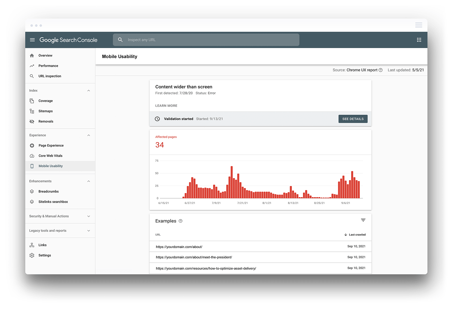
Initially, it’s crucial to identify the pages and elements contributing to the error. Google Search Console’s Mobile Usability report is a valuable tool for pinpointing the pages and elements leading to the “Content Wider Than Screen” error.
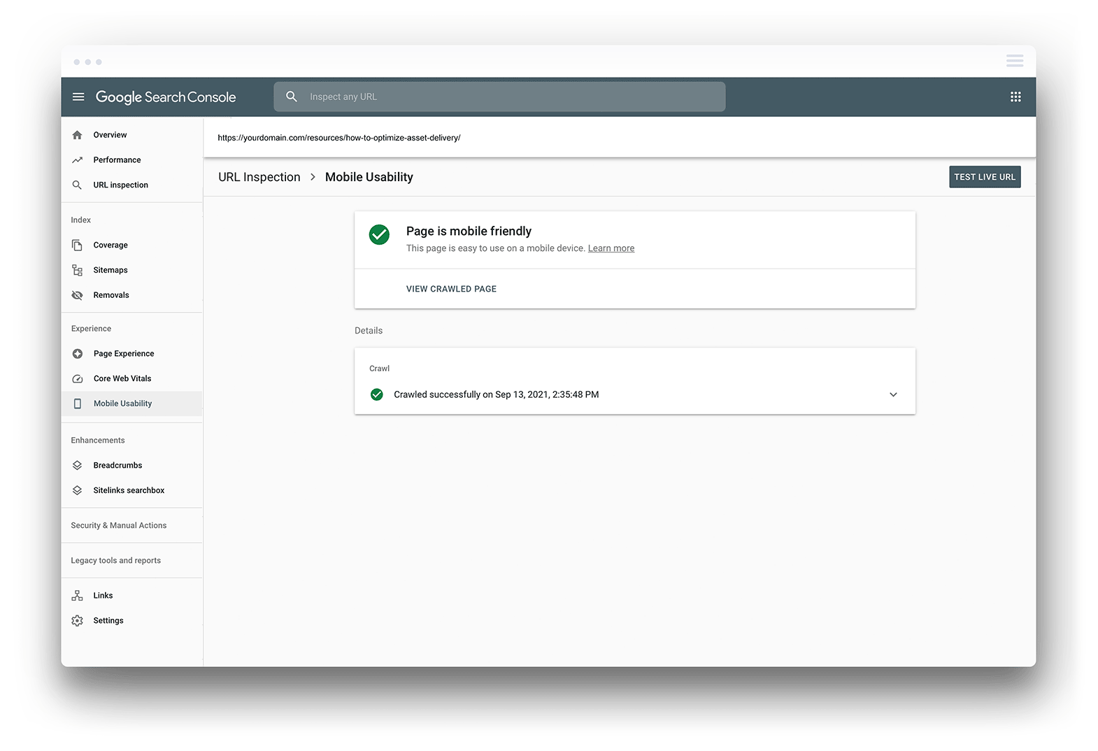
By running the affected URL through Google’s Mobile-Friendly Test tool, you can pinpoint the specific page causing the issue and the content triggering the error. Once you have identified the affected pages, you can focus on resolving the error.
Implementing Responsive Web Design
Adopting a responsive web design is pivotal to addressing the “Content Wider Than Screen” error. Responsive web development ensures that your website adapts to different screen sizes and resolutions, guaranteeing that content is accurately presented on all devices.
To implement responsive web design, you must utilize:
- Fluid grids
- Flexible images
- Media queries
- The CSS Flexbox layout model
Incorporating these essential elements into your website will enhance user experience and minimize bounce rate.

Adjusting Image Scaling
One of the primary causes of the “Content Wider Than Screen” error is images that exceed the width of the screen size. To ensure images fit the screen size, set a max width of 100% for images.
This adjustment will prevent users scroll horizontally, guaranteeing that your images are compatible with the screen size and eliminating the need for horizontal scrolling.
Fine-Tuning CSS Media Queries
CSS media queries and responsive breakpoints are essential for ensuring that your website’s content is adjusted to each screen size. You can set specific responsive breakpoints based on viewport size and device capability by fine-tuning your CSS media queries.
If the mobile responsiveness test fails for certain resolutions, adjustments to the CSS media queries should be made to ensure the website is responsive across all screen widths. Fine-tuning your media queries will help you resolve the “Content Wider Than Screen” error and optimize your website for various devices.
Utilizing Flexbox CSS Layout Model
The Flexbox CSS layout model is a powerful tool for creating flexible and responsive web pages that adjust to different screen sizes. You can create flexible and responsive layouts that adapt to varied screen sizes by leveraging the flex-direction, flex-wrap, and flex-grow properties.
Utilizing the Flexbox CSS layout model will help you pass Core Web Vitals tests and ensure your website provides an optimal user experience on all devices.

Addressing Blocked Resources and Crawlability Issues
In certain scenarios, rectifying the “Content Wider Than Screen” error may necessitate handling blocked resources and crawlability issues. These issues can arise from blocked resources specified in the site’s robots.txt file or cached CSS files, hindering proper page rendering.
The following sections will guide you through the process of:
- Identifying blocked resources
- Resolving crawlability issues
- Ensuring your website’s full optimization for mobile devices
- Ensuring compliance with Google’s mobile-friendly test.
Identifying Blocked Resources with Google Search Console
To identify blocked resources that may be causing display issues, you can use Google Search Console’s URL Inspector and Fetch and Render tools. These tools will help you find images, CSS, and JavaScript files that Googlebot cannot access due to being blocked.
Once you’ve identified the blocked resources, you can review the list and take the necessary steps to unblock the resources, such as updating the robots.txt file or adjusting the website’s permissions.
Fixing Crawlability Issues
Fixing crawlability issues is essential for ensuring your website is properly indexed and ranked by search engines. To address crawlability issues, check your robots.txt and .htaccess files, ensuring they do not block essential resources for proper page rendering.
Using tools such as Google Search Console, you can identify and address crawlability issues by implementing changes to the website’s code, such as adjusting image scaling, implementing responsive web design, and utilizing the Flexbox CSS layout model.

Validating and Monitoring Fixes
Once the “Content Wider Than Screen” error is rectified and any blocked resources or crawlability issues, validating and monitoring your fixes becomes vital to confirm error resolution and uphold superior mobile usability.
The subsequent sections will delve into the use of Google’s Mobile-Friendly Test, Google Search Console, and Google Webmaster Tools to validate and monitor your fixes, thereby ensuring your website’s continued optimization for mobile devices and a seamless user experience.
Using Google’s Mobile-Friendly Test
Google’s Mobile-Friendly Test is invaluable for checking if the “Content Wider Than Screen” error has been fixed. To use the Google Mobile-Friendly Test, follow these steps:
- Enter the URL of the page you wish to test.
- Click the “Test” button.
- The tool will then analyze the page and provide a report on any mobile usability issues that need addressing.
In addition to verifying that the error has been resolved, the Mobile-Friendly Test also offers suggestions for further improvements, such as adjusting image scaling, fine-tuning CSS media queries, and utilizing the Flexbox CSS layout model.
Revalidating in Google Search Console
Once you’ve confirmed that the “Content Wider Than Screen” error has been fixed using Google’s Mobile-Friendly Test, it’s essential to revalidate the fixes in the Google Search Console. To do this, click “Validate Fix” and wait for Google to mark your page as Validation Passed.
This process ensures that your website remains optimized for mobile devices and maintains good mobile usability.
Why You Should Fix the “Content Wider Than Screen” Error
Resolving the “Content Wider Than Screen” error ensures your website provides a seamless user experience across different devices and maintains strong search engine rankings. By understanding the causes of the error, implementing responsive web design, adjusting image scaling, fine-tuning CSS media queries, and addressing blocked resources and crawlability issues, you can easily tackle this common problem.
With these steps in hand, you’ll be on your way to providing a flawless mobile experience for your users.
Frequently Asked Questions
To fix the “Content wider than the screen” mobile usability error, use relative width and position values for CSS elements, make sure images can scale, and use media query breakpoints to ensure pages are designed to look best on all devices.
Content wider than screen pages causes this issue, which results in users being unable to access the content or having to scroll horizontally to see it. To resolve this, make sure to use relative width and position values for CSS elements and that images are optimized for scaling.
To fix clickable elements too close together, you should increase the touch target size by adding additional padding to ensure it reaches 48px.
The “Content Wider Than Screen” error occurs when elements on a webpage are too large for the screen size, causing horizontal scrolling or hidden content.
Responsive web design is a technique that enables web pages to adjust automatically, providing an optimal viewing experience on any device. It ensures that content is accurately presented on all screens, offering a better user experience.


