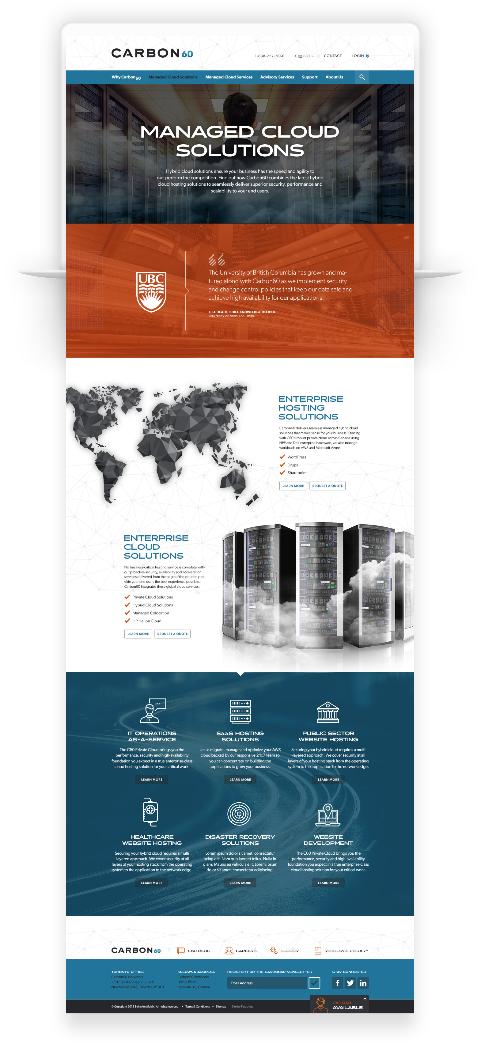
Referencing Science to Tackle a Total Corporate Identity Rebrand
Carbon60 engaged our Toronto web designers at Parachute Design, to spearhead the complete overhaul of their corporate identity, logo design, and website design. This was no small task as the existing brand had not only served as the foundation of Canada’s top managed web hosting company for nearly 20 years, but the core concept and vision behind the existing brand was deeply rooted in the corporate culture. To make this project even more interesting, we were tasked with encompassing a number of different views and service offerings within the Carbon60 brand to speak more effectively to a variety of different audiences.
Fortunately, Parachute Design is not just a Toronto web design company; we have also been creating winning logo design and branding materials for businesses of all shapes and sizes for 15 years, both locally and nationally.
Through our initial strategy and design process, we worked closely with Carbon60 and their long-standing digital marketing agency to refine the core brand message and develop a theme based on the Carbon60 molecule, one that has served as the core of the company’s belief system since their inception in 1999. Drawing upon the properties of the Carbon60 molecule, we were able to help focus the brand design on the concepts of stability, flexibility, and efficiency. The development of this molecular, geometric theme was then carried throughout the new logo design, and the custom website design as well.

Custom Website Design
Parachute Design has many years experience in creating website design for technology companies across North America. Having an opportunity to collaborate with another digital marketing agency on a project of this scale was a great opportunity to expand our web design knowledge and create a complete online experience. Through this collaboration and a series of discovery sessions, we collectively redesigned the website information architecture to improve the overall user experience, as well as tackling some search engine optimization roadblocks that had existed within the original website.

As with many managed hosts today, Carbon60 has made the move to add highly specialised managed WordPress hosting as a core service offering. Throughout our brand development process, we slowly moved the corporate colour palette from a bright burning orange to a more familiar WordPress blue to bridge the gap between Carbon60’s platform and those more familiar with WordPress. To support the blue and also to respect the original brand, we included a subdued burnt orange in a supporting role to add some depth and create more opportunity and flexibility for additional marketing materials. The refined colour scheme offers a more confident, mature, and professional look to the refreshed corporate identity.
Once everyone was on board with the design strategy and plan of action, we moved forward and worked together to define a very crucial and specific goal for the new website design. We were no longer targeting general search terms such as “web hosting,” but now broadening the key service offering to a handful of highly specialised web services that needed to be targeted individually, and also help funnel users to the specific information they are seeking.


